B
I
T
C
O
I
N
U
S
E
T
R
E
N
D
S
T
H
R
O
U
G
H
T
H
E
B
L
O
C
K
C
H
A
I
N
,
R
E
D
D
I
T
A
N
D
C
O
I
N
M
A
P
B
L
O
C
K
C
H
A
I
N
The Bitcoin blockchain was analyzed from 2009 up to December 2017 to estimate the uses of bitcoins.

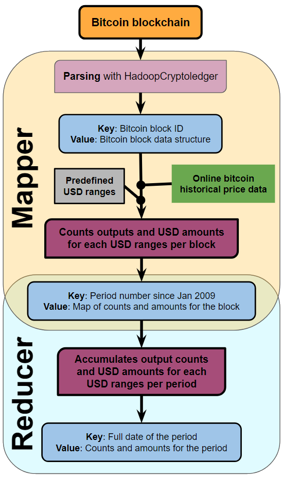
The two main results researched are:
  • The monthly counts of transaction outputs belonging to different USD ranges
  • The monthly cumulative amounts of these outputs belonging to different USD ranges
The following transaction outputs are ignored for this analysis:
  • Miner rewards, known as coinbase transactions
  • Self-transfers of funds, likely to be single-input, single-ouput transactions
  • Change outputs, likely to be the largest output of a multiple output transaction
The following four charts represent the data obtained.
The percentages of monthly ouputs per USD range is plotted to see how trends changed in a clearer way
The percentages of monthly USD transferred per output USD range is also plotted.
The following two charts focuses on USD ranges below USD 300 and since January 2013
The diagram below describes how the data was obtained using big data tools.
R
E
D
D
I
T
Reddit data was scrapped and analyzed from 2009 up to December 2017 to estimate the uses of bitcoins.

The aim is to count the monthly number of occurrences of Bitcoin related keywords in Bitcoin related posts, comments and threads. The following words were counted:
  • gold
  • store
  • atm
  • tip
  • betting
  • goods
  • art
  • cafe
  • diamond
  • grocery
  • hotel
  • microtransaction
  • mixing
  • restaurant
  • salary
  • travel
The following four charts represent the data obtained.
The following chart focuses on periods since January 2013
The diagram below describes how the data was obtained using big data tools.
C
O
I
N
M
A
P
Coinmap entire data was obtained from their API and analyzed.

The aim is to count the monthly cumulative number of venues accepting bitcoins per venue type. The following venue types were counted:
  • shopping
  • food
  • lodging
  • atm
  • cafe
  • nightlife
  • attraction
  • grocery
  • sports
  • transport
  • trezor retailer
  • drug store
The following two charts represent the data obtained.
The relative percentages of monthly cumulative venues per venue type is plotted to see how trends changed more clearly.
The diagram below describes how the data was obtained using big data tools.
C
O
N
C
L
U
S
I
O
N
The data
x